The first two blogs of this series outlined some of the benefits of using technology to improve analysis and decision making around the data generated in your utility, as well as examples of data sources that your utility may already have that could be harnessed in the process. Here you’ll see that data in action, with examples of how the use of available technologies improves its usefulness.
Data Collection
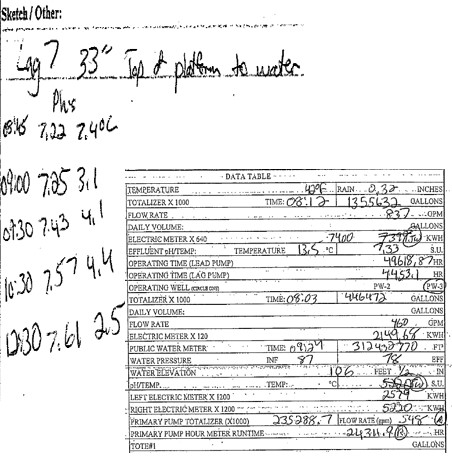
I’m sure the example below looks familiar. There are boxes and filing cabinets full of tables and sheets like this in nearly every plant or facility. They represent the way data has been collected for a long time. The inherent issues with this are obvious: cumbersome to fill out, file and store, and challenging to extract data from.
With the technology available today, including powerful mobile phones and tablets, the way to collect data can — and should — look more like this:
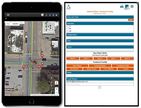
The depicted applications (left: GIS; right: DoForms) are connected to the cloud, so data is collected and displayed in near real time. Operations staff can input data directly into forms built specifically for the mobile interface and the collected information is stored in a database for multiple applications to access. There’s no need to manually transfer written figures or notes from a round sheet into a computer back in the office; that task is already complete. Reducing the number of times information needs to be ‘touched’ reduces transcription errors, reduces time, and saves labor and budget.
Reports
In the past, when reports presenting data sets were produced, they were obsolete almost from the moment they were printed. Changes to the data were not dynamic, so there was always a feeling of working with historical information rather than live data. Reports were often used once and then stored for “future uses,” which almost never occurred.

With available technology, reports can now look more like this:
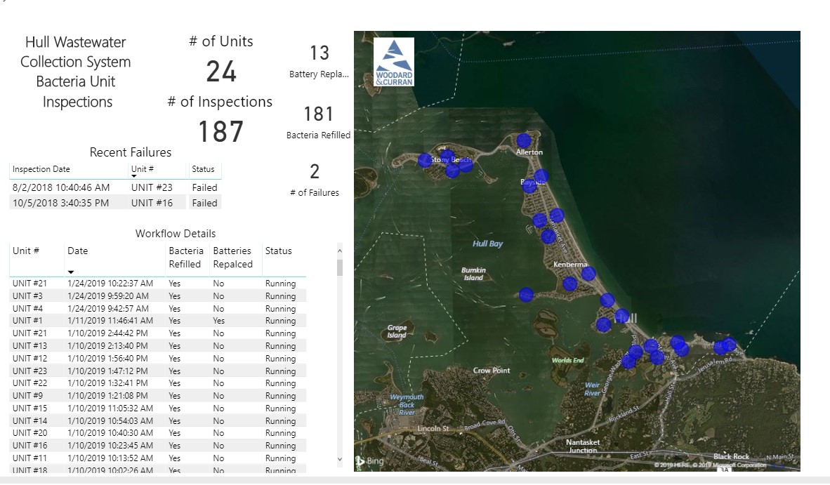
The above report depicts the status of bacteria unit inspection process. Connecting both CMMS and GIS information to BI application produces a result that is much more powerful and useful than the same information on a printed page. The information is displayed in both tabular and graphical form, to provide multiple methods for easier analysis. When an entry is clicked in the table, a point on the map highlights the physical location where the data was collected — in this case, where the inspection was performed. Combining this reporting with mobile data collection means the progress of inspections can be tracked in near real time.
Trends
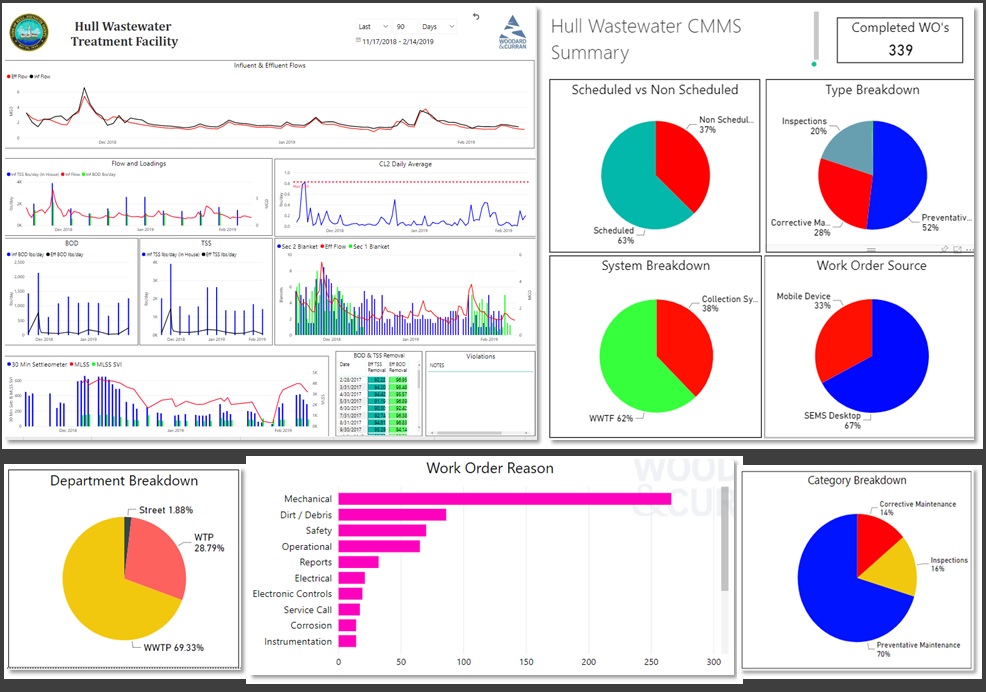
One of the greatest strengths of business intelligence is its ability to trend data from disparate sources to identify patterns, problems or associations that might not be otherwise discovered. Trending is not new; it is a feature available in Microsoft Excel, and no self-respecting SCADA system would be worth its salt without the ability to trend the data collected. With business intelligence, data from multiple sources can be combined into trends that may reveal additional insights that would not be evident looking at the data separately.
These key features work together not only to save time and money, but to help utility runners better manage their operations in the long run. Long-span records and trend reports that are easily accessible help operators troubleshoot issues, plan upgrades and repairs, and manage labor. You’d be hard-pressed to find a filing cabinet that can do all that.
